Perler Bead Color Matching: Palettes, Dithering, and Clean Blends
Color matching is the difference between a pattern that looks crisp and one that feels dull or muddy.
Pixels can show millions of colors, but beads cannot. The goal is not a perfect match, it is a believable match.
These tips help you pick better palettes, blend gradients, and keep contrast strong when you build.
Start with a Palette, Not a Photo
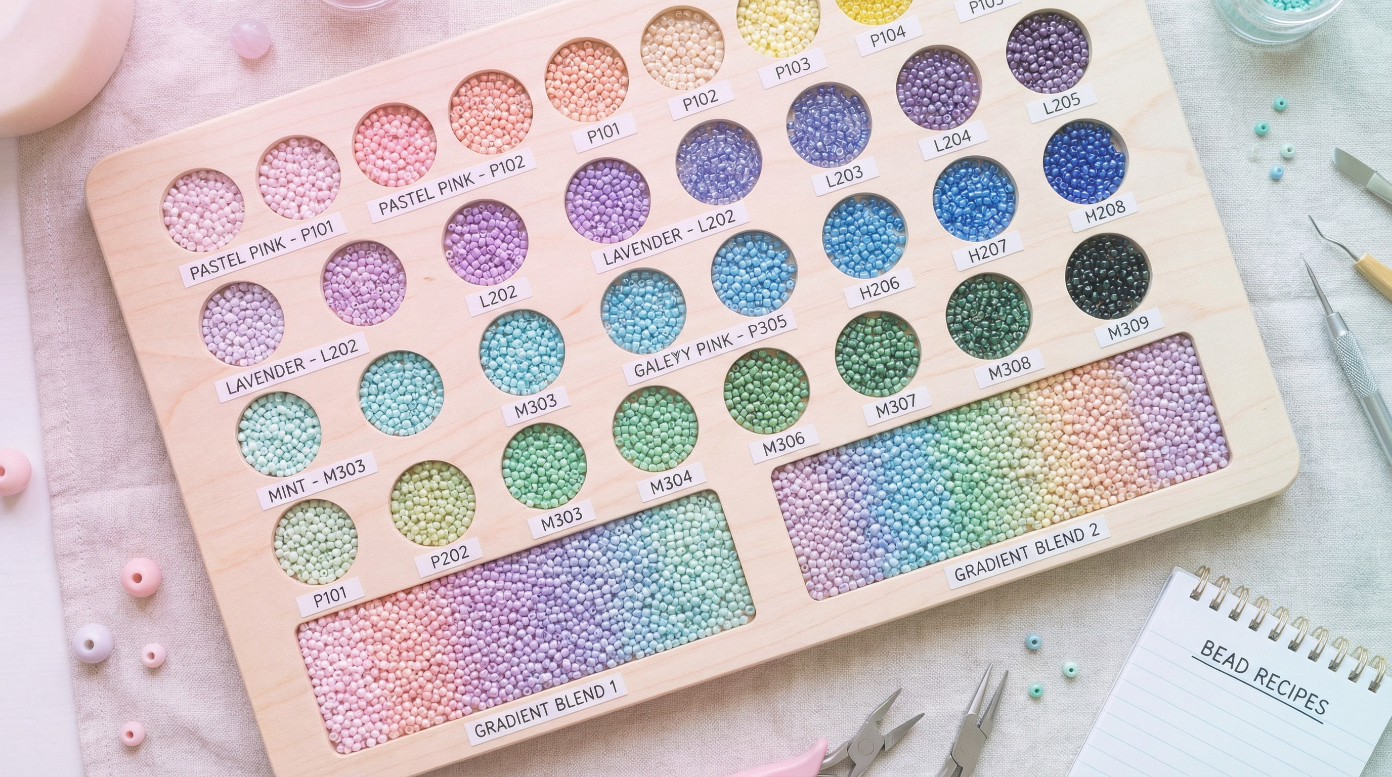
Choose your bead brand first so the colors in the pattern are the colors you can actually buy.
In BeadPattern, switch palettes before you convert so the algorithm maps to real bead colors from the start.
When you lock the palette early, your edits stay consistent and you avoid chasing colors that do not exist.
Dominant Color Beats Average Color
Average-color conversion often produces gray or brown mush where edges should be sharp.
Dominant color mapping keeps the most common shade in a region, which preserves contrast and avoids dark halos.
If your result has black edges or dirty shadows, reduce the palette or increase the merge threshold.
Use Dithering Patterns for Gradients
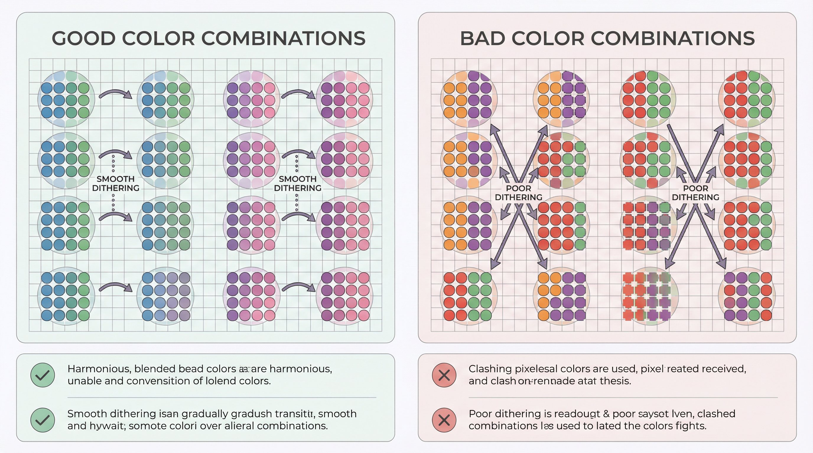
Beads cannot create smooth gradients, but you can fake them with controlled patterns.
Keep dithering subtle. If you can see the pattern before you step back, it is too dense.
Handling Skin Tones and Subtle Shades
Faces are where color errors are most obvious, so simplify early.
Pick one mid tone, one shadow, and one highlight, then reserve extra colors for eyes and lips.
If the skin looks too red or too yellow, shift the mid tone and keep the shadows neutral.
Avoid pure white for highlights. A light peach or warm beige looks more natural.
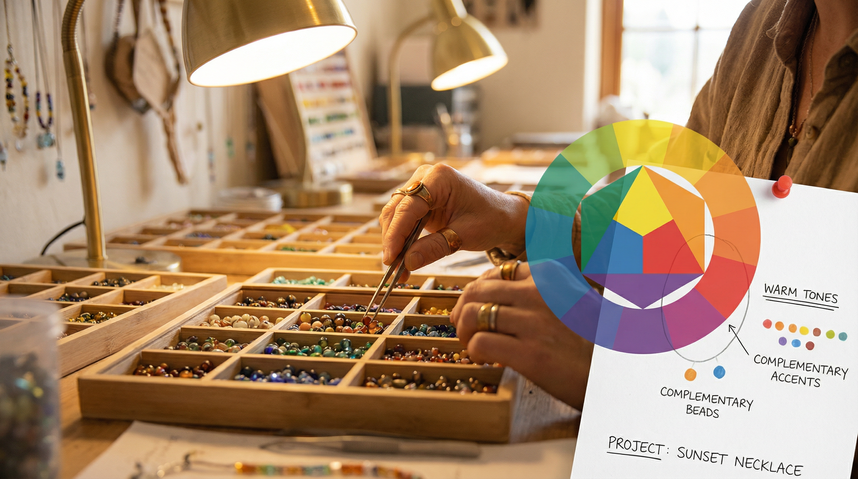
Outline Strategy for Strong Contrast
Outlines are not required, but they help when the subject blends into the background.
Use a darker shade of the main color, not pure black, for a softer look.
For cartoon styles and pixel icons, a single-pixel outline keeps shapes readable.
For portraits, outline only key edges like hair, glasses, or collars.
Palette Size by Project Type
If you are a beginner, choose the smaller range and focus on clean shapes.
Fixing Muddy or Flat Colors
Muddy colors usually come from too many similar shades fighting each other.
Remove near-duplicate colors and let one shade lead each area.
If everything looks flat, add one strong accent color for contrast.
Sometimes one extra shadow color does more than five tiny variations.
Quick Checklist Before You Bead
Final Thoughts
Great color matching is about restraint.
Pick fewer colors, use pattern-friendly blends, and lean on contrast.
When the palette is right, the build becomes faster and the finished piece looks sharper.